If you work in science, tech, or healthcare marketing, you deal with complex topics, strict rules, and the need for clear communication daily. However, one key area is often missed, despite it affecting millions of users: web accessibility.
Accessibility means making your digital content usable for everyone, including people with disabilities. It’s not just best practice, it’s even regulation for public sector bodies. It also helps with SEO, and reflects well on your brand.
Let’s break down what accessibility really means, why it matters, and some easy steps you can take today to make your site more inclusive.
What Is Web Accessibility?
Web accessibility means designing and developing websites, tools, and digital content so that everyone can use them, including people with:
- Visual impairments
- Hearing loss
- Motor and mobility challenges
- Cognitive and neurological conditions
Accessibility ensures that users can perceive, understand, navigate, and interact with the web so that they can contribute to it.
But accessibility isn’t only for people with permanent disabilities. It also supports:
- Older users with age-related changes in vision or dexterity
- Those with situational limitations, such as bright sunlight or a noisy environment
- Users on slow or unreliable internet connections
- People using small screens or alternative input devices
In other words, accessibility helps everyone have a better digital experience.
Why Should Marketers Make Accessibility a Priority?
In scientific, technical, and healthcare sectors, accuracy and trust are everything. But even the most credible website can fall short if people can’t access or understand the information.
Here’s what’s at stake:
- Regulatory risk: The new European Accessibility Act (EAA) will apply from June 2025 and affects a wide range of digital services, including websites, apps, and online marketplaces. Failure to comply can lead to fines and reputational damage.
- Reach: According to the WHO, an estimated 16% of the world’s population lives with some form of disability. If your content isn’t accessible, you’re shutting out a significant portion of your potential audience.
- SEO benefits: Accessibility practices like alt text for images and descriptive headings also improve your visibility on search engines.
- Brand perception: Inclusive design shows that your organization cares about accessibility. In sectors where ethics and empathy matter, this can be a powerful differentiator.
Non-EU Organisations
For non-EU organisations that sell products or services in the EU, they will be required to meet the accessibility standards set out by the Union. Compliance will not only be best practice from a UX standpoint, but also reduce legal risk.
10 Easy Changes to Make Your Website More Accessible
You don’t need to be a developer to start making your website more accessible. Many improvements can be made through content strategy, UX design, and smart use of your CMS. Here’s a breakdown of straightforward actions you can take today.
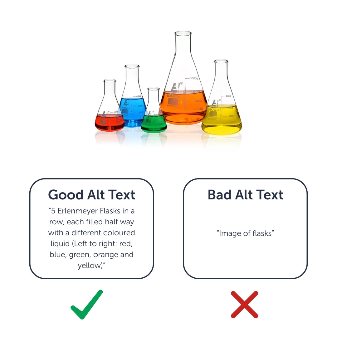
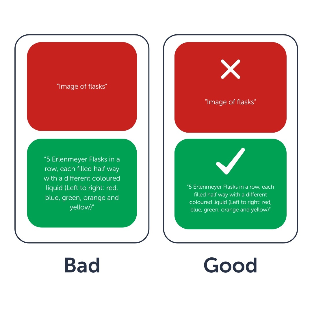
1. Add Descriptive Alt Text for All Informative Images
Why it matters: Alt text provides descriptions of images for people using screen readers and fallback text if images fail to load.
What to do:
- Describe the image’s content and function: For example, “Diagram showing the RNA sequencing process.”
- Avoid starting with “Image of…” — screen readers already identify images.
- Use empty alt text (alt="") for purely decorative images so they’re skipped.
Use your CMS’s image uploader to add or edit alt text and create guidelines for image contributors.
2. Add Captions and Transcripts to Videos
Why it matters: Captions help people who are deaf, hard of hearing, or non-native speakers. Transcripts also improve SEO and mobile usability.
What to do:
- Add closed captions that sync with the audio.
- Write or auto-generate a transcript that includes key dialogue and descriptions of important visuals.
- Use a video player that supports keyboard navigation and screen readers.
You can also add a link to the transcript beneath your video so users can download or search it easily.
3. Use Descriptive, Meaningful Link Text
Why it matters: Screen reader users often navigate a page by scanning the links. Generic phrases like “Click here” or “Read more” are meaningless out of context.
What to do:
- Be specific: Instead of “Read more,” use “Read more about our CRISPR applications.”
- Match the tone: Ensure the link text fits naturally into your content’s voice and tone.
- Identify file types and formats: For example, “Download the white paper (PDF, 1.2MB).”
.jpg)
Helpful tip: Our free SEO site audits can help identify missing or unhelpful alt tags across your site (a quick way to boost both accessibility and search performance.)
Request a Free SEO Site Audit
4. Design for Keyboard Navigation
Why it matters: Many users (including those with mobility issues) navigate websites using a keyboard instead of a mouse.
What to do:
- Ensure users can access all interactive elements using the Tab key.
- Provide visible focus indicators — e.g., a border or highlight around buttons or links when tabbed to.
- Implement a “Skip to main content” link at the top of the page so users can bypass repeated navigation.
How to test: Try navigating your website using only the keyboard (no mouse!) and see if you can reach every interactive item and complete key tasks.
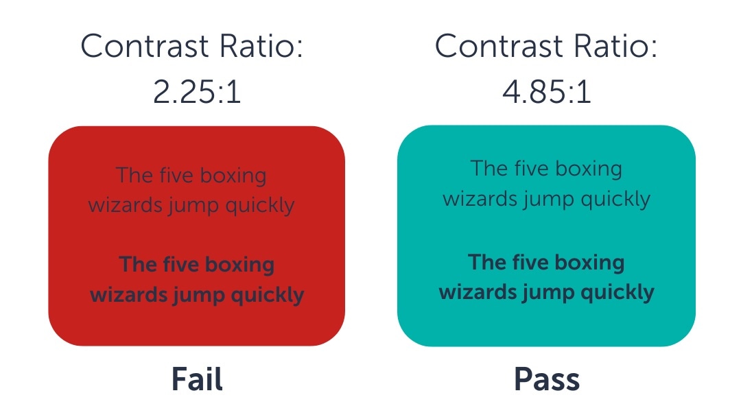
5. Ensure Strong Colour Contrast
Why it matters: Low contrast between text and background can make content unreadable for users with visual impairments or colour blindness.
What to do:
- Maintain at least a 4.5:1 contrast ratio for normal-sized text.
- For large or bold text (18pt+), a minimum of 3:1 is acceptable.
- Avoid using pure black (#000000) on pure white (#FFFFFF), which can cause strain or visual distortion for some users.
Tools to use:
6. Simplify and Clarify Web Forms
Why it matters: Forms are often critical conversion points. Poor accessibility here means lost leads.
What to do:
- Use clear and persistent labels for each input field. Never rely on placeholder text alone.
- Avoid placing multiple fields in the same row unless they’re tightly related (e.g., City/State/Zip).
- Highlight errors with colour and text cues. For example, “Please enter a valid email address” in bold red text.
- Make sure form fields are large enough and clearly outlined for users with vision impairments.
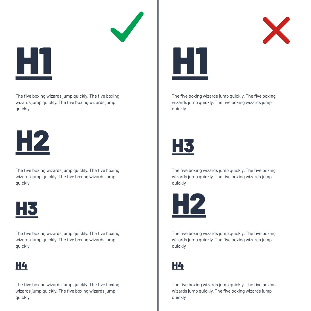
7. Use Proper Headings and Page Structure
Why it matters: Headings aren’t just visual styling. They give screen reader users a way to understand and navigate your content’s structure.
What to do:
- Use one <h1> per page for the main title.
- Use nested headings logically (<h2> for major sections, <h3> for subsections).
- Don’t skip heading levels (e.g., don’t jump from an <h2> to an <h4>).
- Visually distinguish headings from body text with font size, weight, or spacing.
8. Accessible PDFs and Downloadable Resources
Why it matters: PDF downloads are a key metric for engagement and proving ROI. They are designed to share content, but many are inaccessible to screen readers. If users can’t access the content after downloading, they miss key information and may look elsewhere, disrupting their buyer journey and costing you potential leads
What to do:
- Ensure PDFs are tagged properly with headings, alt text, and a logical reading order.
- Use accessible PDF templates that follow WCAG guidelines.
- Provide an HTML version or web-friendly alternative whenever possible.
You can test your PDFs with Adobe Acrobat’s built-in accessibility checker or PAC (PDF Accessibility Checker).
9. Avoid Using Colour Alone to Communicate Meaning
Why it matters: Relying on colour alone excludes users with colour blindness (approximately 300 million people) or visual impairments. Colour should be one of several cues, not the only one.
What to do:
- Don’t use red/green or other colour distinctions to convey status, like “required fields in red.”
- Combine colours with icons, labels, or textual cues (e.g., “Success” with a checkmark).
Tip: Use a colour blindness simulator to test how your page looks to users with different types of colour vision deficiencies.
10. Optimize Data Visualizations
Why it matters: Charts and graphs can be difficult to interpret for users with visual impairments or colour blindness.
What to do:
- Label axes and data clearly.
- Use patterns or textures in addition to colour to differentiate elements.
- Include a text description of the chart’s key takeaway.
- Offer a data table alternative for screen reader users.
By starting with even a few of these changes, you’ll make your content more inclusive, compliant, and user-friendly. You will also demonstrate that your organization understands the importance of access for all.
Accessibility Is a Journey, Not a Checkbox
Getting started with accessibility might feel overwhelming, but you don’t need to do everything at once. Even small changes can make a big difference. By taking steps now, you’ll be ahead of the curve and better able to serve all your users.
In industries where accuracy, inclusion, and credibility are paramount, accessible design isn’t just a “nice to have”, it’s an essential part of how you show up in the world.
Ask about website design